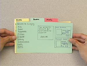
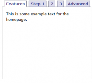
Paper prototyping is a great way of developing webbased software that meets the users needs. The basics are simple. You take a piece of paper, and you draw the elements you need on a piece of paper. One piece of paper for each webpage. Then you talk to a user, and ask him to evaluate your prototype. You show him one piece of paper at a time, and ask what he would do. When he “clicks a link”, or “presses a button” you show him the piece of paper that corresponds to his choice.
Paper prototyping has some distinct advantages.
- It’s easy. You can go from idea to paper prototype in less than an hour.
- It’s easy to show users.
- Users don’t get caught up in criticising your design, since there isn’t really any design to criticise. The conversation is only about usability.
- It’s easy to change when you get feedback – just draw another piece of paper.
The proper way of paper prototyping is to iterate your way to something your users understand and feel comfortable with. Make a paper prototype, talk to users, get feedback, make a paper prototype, talk to users, you get the idea…
I’ve had some success taking this idea one step further. A few years ago I was contracted to redo the backend for a large webshop. The job was basically to get a lot of external systems (supplier systems, automated customer e-mails, postage tracking, inventory handling, etc.) to play nicely together and make it all available to the employees in a well designed web interface. I’ve always liked paper prototyping, but thought it had a few drawbacks, primarily that users get confused and can’t keep track if there are too many pieces of paper, and that you have to be there in person with the user for each iteration, which can end up taking a lot of time. So I did HTML prototyping instead, and it worked great. There are some simple rules I followed to get a good result:
- No design. One of the great things about paper prototyping is that users don’t comment the design because there isn’t one. You need to carry this over to HTML prototyping.
- Don’t use a lot of text. If you have lots of text users will focus on that instead of the interaction design.
- No backend code. Use only HTML, once you start doing back-end code you’ve gone too far.
HTML prototyping worked amazingly well for me and for the client. I could have more than one person testing just by sending them the link. The manager in charge could follow along. I didn’t need to be there in person, except for the initial meeting where I brought the first iteration and explained the concept.
After a few iterations where we caught some bugs, stupidities and inconsistiencies the interface was exactly as the users of the new system wanted it to be. They had time to click around at their own pace without an obnoxious consultant hovering around waiting for them to make a choice or perform an action, they could spend some time thinking about their actions, and they could click back and forth and familiarise themselves with the new system. Under these circumstances where they weren’t stressed by external factors (me!) and could get a good feel for the whole system they provided some amazingly good feedback.
When everyone agreed that the interface performed as it should, it was handed over to a designer to make it fast, slick and good looking. After the design process, I spent some time writing up documentation for the development team that would actually impement all the functionality behind the scenes. It turned out that HTML prototyping helped both the designer and the programmers tremendously. The designer could quickly get an overview of the job by clicking around a bit, and he could implement his design by changing the HTML and inserting the appropriate images and CSS. The programmers received an almost finished frontend that wouldn’t change mid-development, and only needed to code up the underlying functionality.
How did the new interface perform? I spoke to the manager after 6 months and he told me that they had seen a 60% drop in the time employees spent handling orders in the backend system.
Not bad.

